


CAMH Raising awareness about Canada’s first national three-digit suicide crisis hotline 9-8-8.
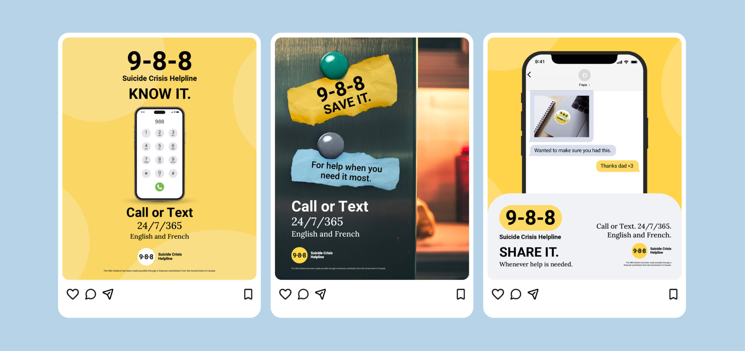
9-8-8 Suicide Crisis Helpline opened on November 30, 2023, as Canada’s first three-digit number for anyone thinking about suicide or worried about someone else, by call or text, in English and French, at any hour. A year on, the service had a visual identity, a library of tested assets from two small paid efforts the agency had delivered, and a problem: three Canadians in a hundred could name it unprompted.
Awareness of a helpline is only worth building if the number and its purpose stays with people, and earlier work, shared no single message a viewer could take away. So, before channels or budgets, the strategy committed to one memorable line that every asset, new or existing, would use.
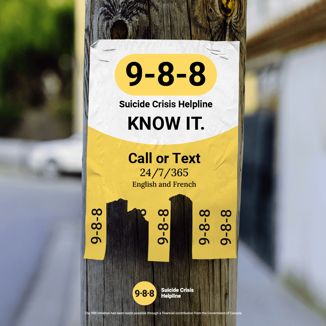
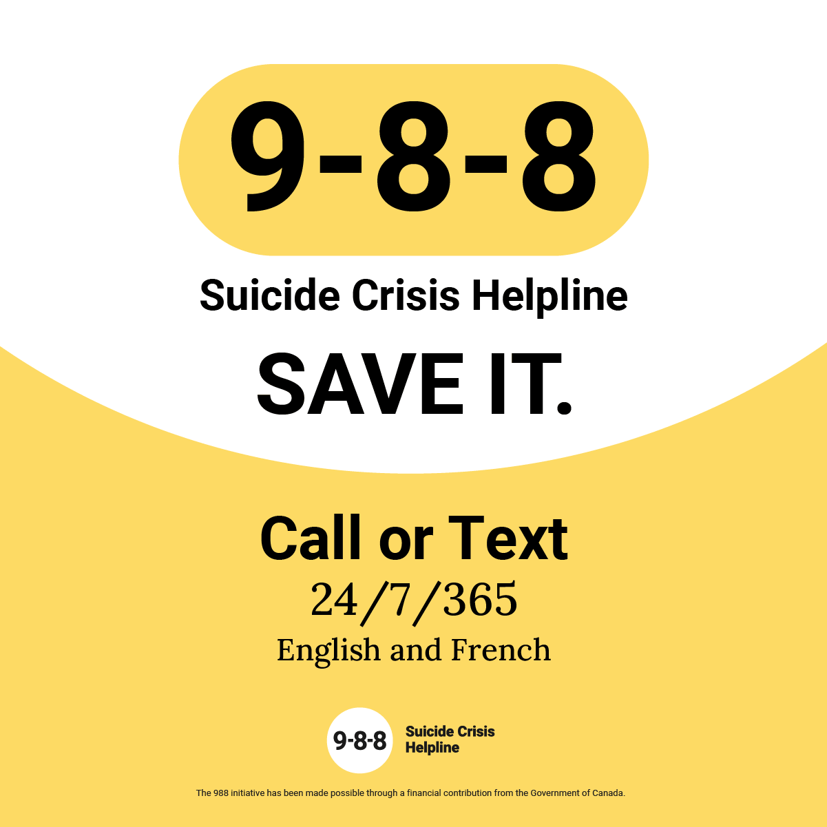
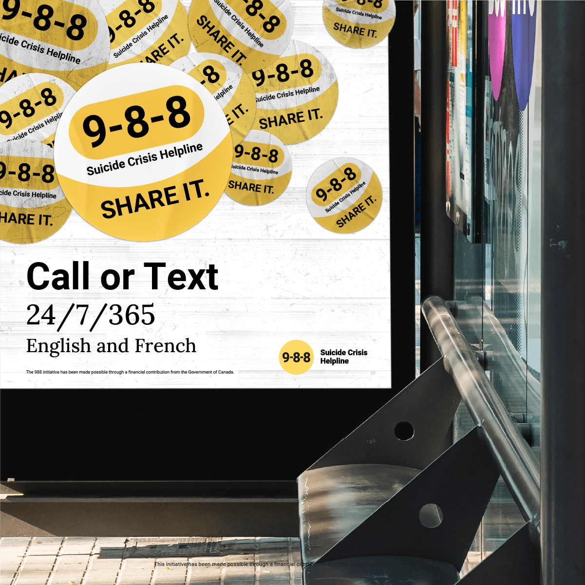
That line became “Know it. Save it. Share it.”
Our objective was to help more Canadians name 9-8-8 unprompted, recognize the number and the full service name when asked, and trust it enough to pass it on. This led to a creative strategy that translated that into one job for every asset: make the number impossible to miss, give people a reason to keep it before they need it, and do both in language a person could safely read.
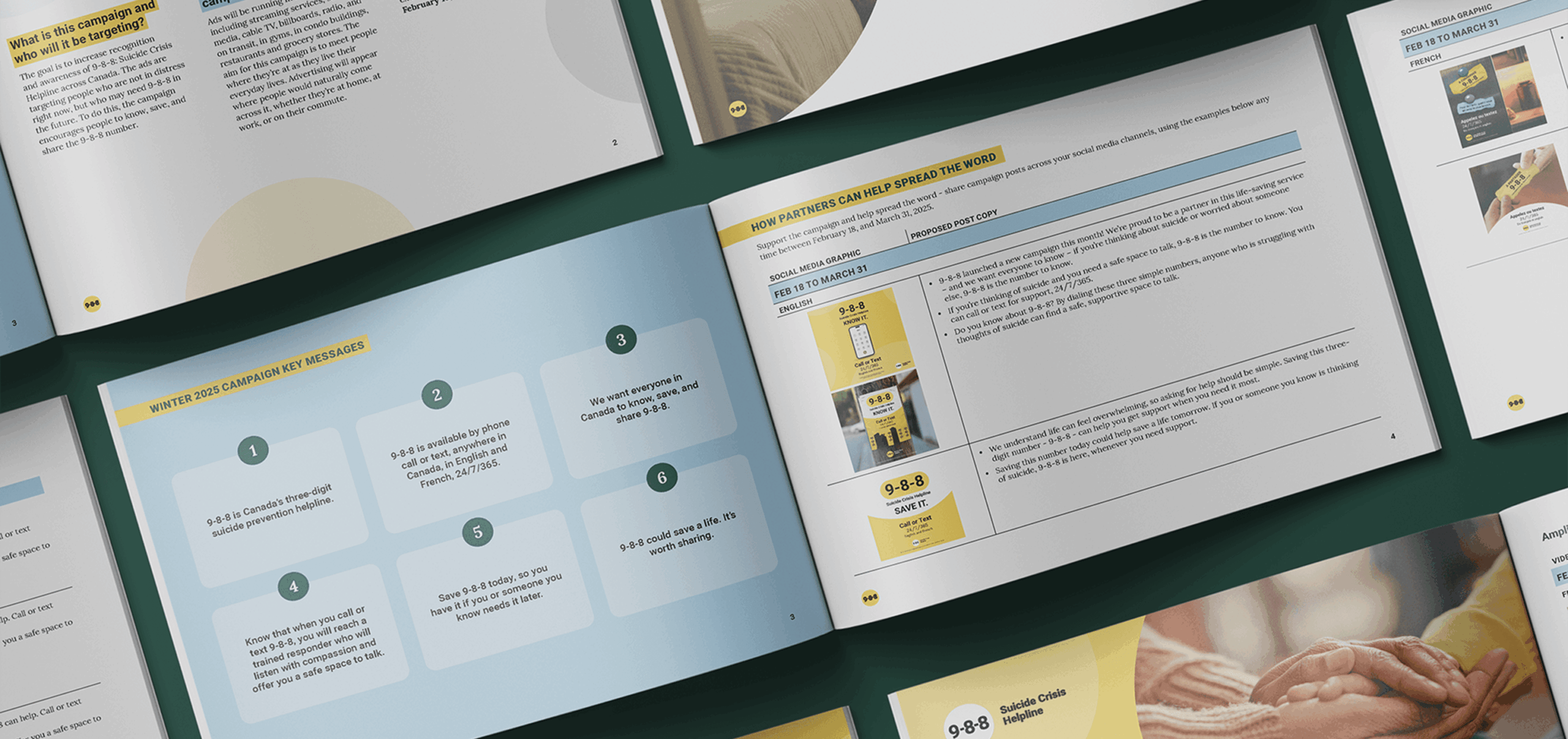
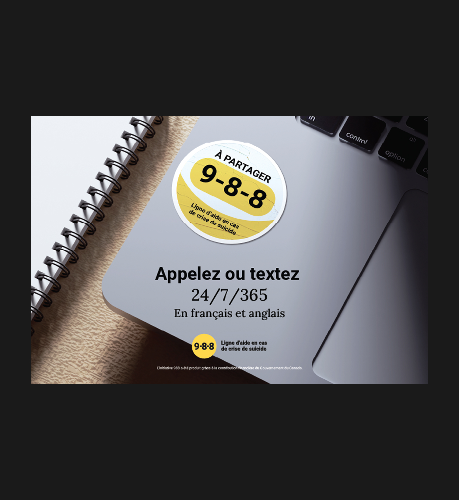
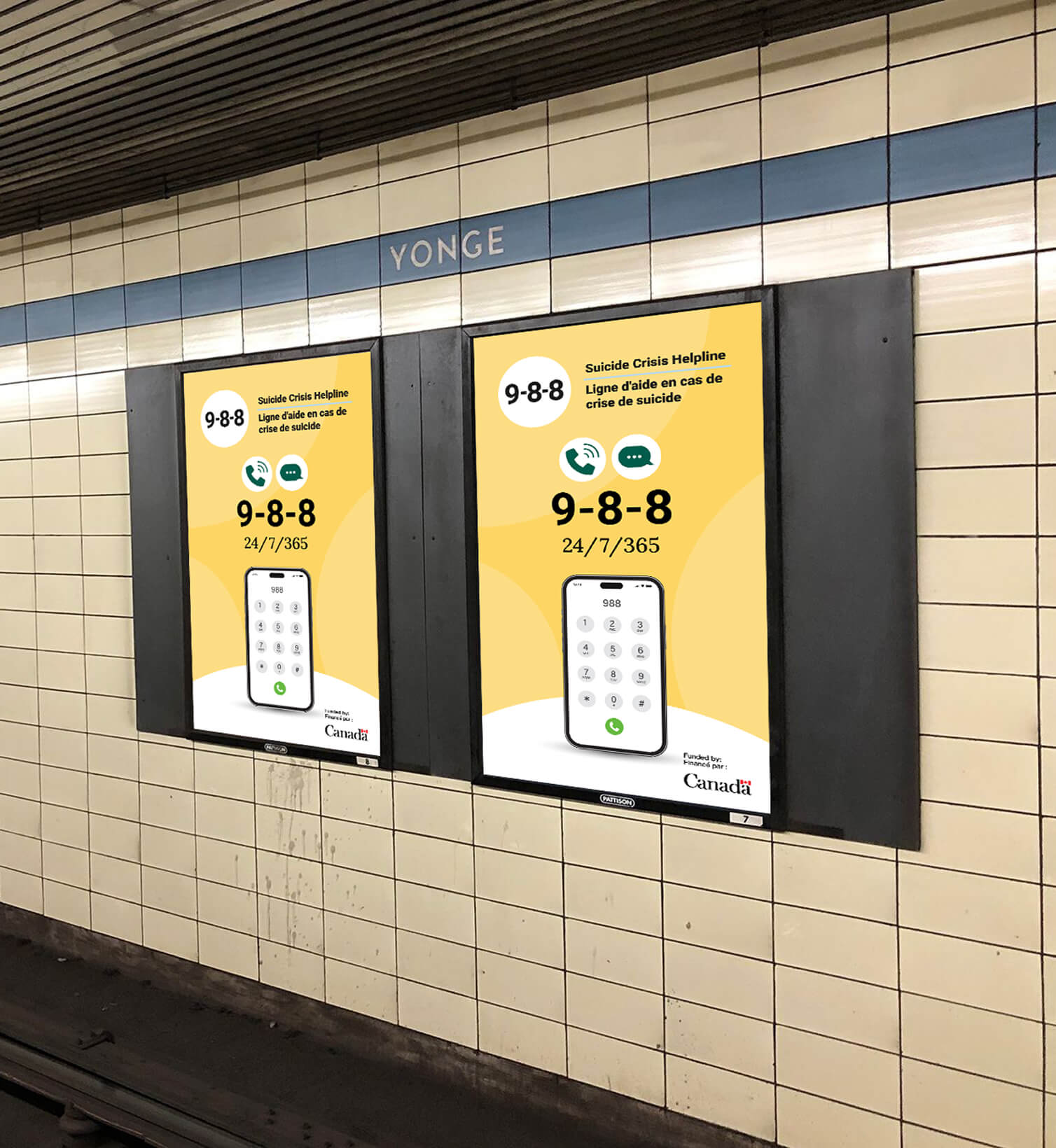
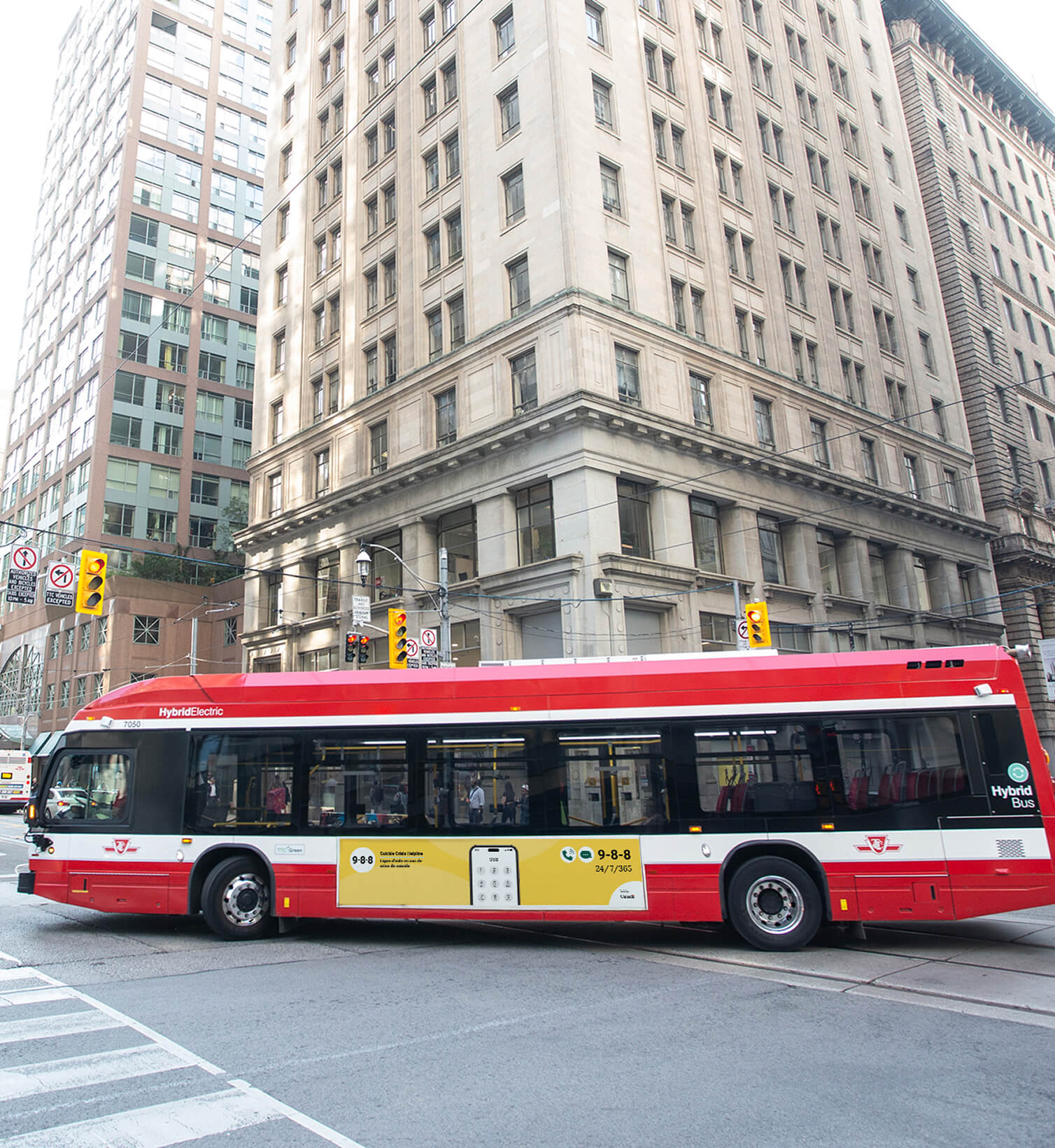
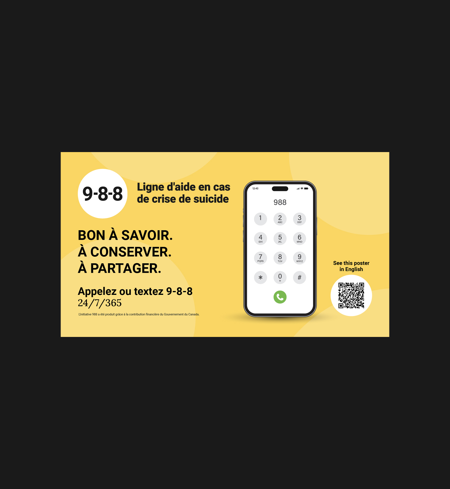
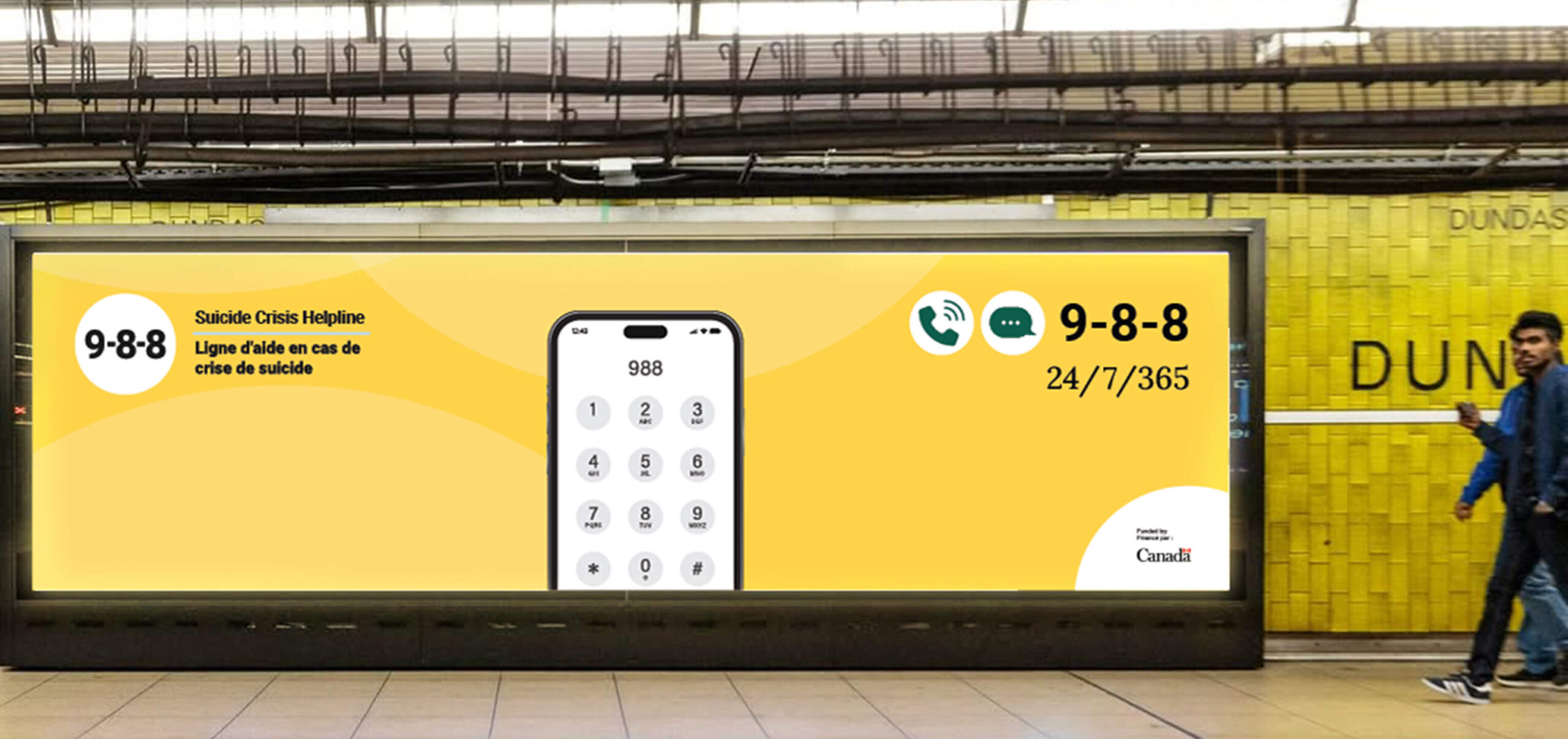
With the goals clear, three decisions came next. First, we made the number the hero. Data had shown that a plain image of a phone with 9-8-8 on screen outperformed animated executions, so 9-8-8 was made the largest element in every frame, in every format, and always paired with “Suicide Crisis Helpline” so that the number and the name were learned together. Second, the line does the remembering. “Know it. Save it. Share it.” is three verbs, each a message pillar with its own proof point: Know it (what 9-8-8 is, available by call or text, 24/7/365, staffed by trained responders, in English and French); Save it (keep the number in case you or someone you love needs it); Share it (9-8-8 could save a life, it is worth passing on). Third, the audience is everyone who is not in crisis today. The client’s research showed the people least likely to know 9-8-8 were those with no current connection to it, so every line of new creative was written for a bystander, a parent or a friend, never for someone in acute distress.
The visual system followed the same logic. Two directions ran side by side: warm photography of ordinary moments, and a graphic treatment built on the number in the campaign yellow, chosen for how it reads at distance on a screen or a billboard and as the colour the service already owned. A fixed end card closed every video: 9-8-8, the tagline, call or text 24/7/365, we can help. The whole system was designed so that any single asset, seen once, taught the number, and any two assets, seen together, were recognizably one campaign.
Ultimately the campaign was able to meet each of the defined objectives, it helped to more than triple unaided recall of 9-8-8, and served as a critical tool in the awareness of this new service.


View more projects
-

Association of Municipalities of Ontario
Strengthening Democracy in Ontario / Building a stronger democracy in Ontario / Encouraging More Ontarians to run for municipal office
-

Nova Scotia Loyal
Connecting Nova Scotians to the producers in their community
-

VIA Rail Canada
Creating a friendly new face for VIA Rail’s brightest train.